Ten Things a Bookseller Wishes Authors Knew About Cover Design
Guest Post by the Owner of The Ripped Bodice Bookstore!
Several years ago, Leah Koch, one of the owners of The Ripped Bodice Bookstore, generously shared her thoughts on cover design with me. I’m thrilled to bring back her top ten list today. (A must-read for indie authors!) With so much AI art on the market and with so many indie authors making their own covers, I am delighted to bring you insights and information from one of the best in the business. Enjoy!
Leah Koch, co-owner of The Ripped Bodice Bookstore
Howdy! I am very excited to share with you today some of the many things that I think authors should know about cover design if it is their goal to have their book carried in an independent bookstore. I share my insights from personal experience:
I own and operate one of the only romance focused independent bookstores in the world!
Because of that, everything I am about to say is based solely on books that are being sold in an actual, physical bookstore. There are certainly different best practices for e-books, but that is not what we’re talking about here.
This advice is mainly for people who have control over their covers. Unfortunately, most people who chose to publish with a large publisher don’t get a whole lot of say in their cover design. But you can certainly take ideas from this as well. While I have no hard data on the subject, I would wager to guess that we carry more self-published books than almost any store in the world. So I have seen a lot of self-published covers over the years!
Just a reminder that what people like is not universal. Someone might not like horses, but that doesn’t mean it’s a hard and fast rule that you should never put a horse on the cover of your book. I will try to speak broadly about some themes and general best practices for your cover.
I will be using pictures to illustrate examples of “good stuff” or successful covers. There are no pictures for the “bad stuff” because I didn’t want to hurt anyone’s feelings by asking if I could use their cover to illustrate how terrible it is… So let’s get to it!
1. Your cover is more important than the book inside.
From a selling standpoint. Of course the words inside are more important, but someone has to pick up the book first! We have a direct submission form on our website where authors can tell us about their books and we can consider them for stocking in the store. 9 out of 10 books get rejected based on their cover. That means I didn’t even look at the subgenre or read the summary. I knew with one look at the cover that it wouldn’t sell in the store. Now that we have established just how important the cover is, let’s get to some specifics.
2. Unless you have serious experience, you need to hire a professional.
Given that we just established how important your cover is, perhaps it won’t shock you to hear that you need to hire someone who knows how to design covers. If you don’t want to spend money on a cover, you need to consider what your goal is in publishing a book available in print. If any part of that goal is either to make money or entice people to pick up the book, then you are going to have to spend money on the cover. That being said, you are the boss! You still need to know what you are asking for and how to make your book successful in the print market.
3. Chill with the Photoshop.
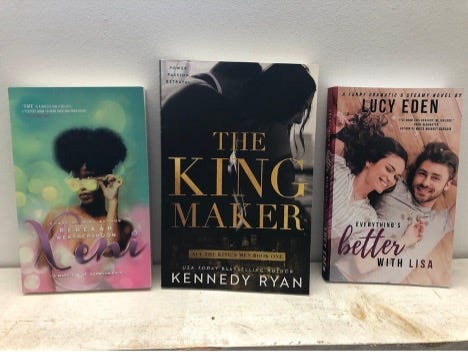
Let’s get into some examples. Romance cover design can generally be split into two camps: photo or illustrated. We’ll start with covers that use photographs as the main image. You do not have to include every part of your plot on your cover! If your book involves a veterinarian and a boat captain, there is a temptation to make sure there is a dog and a boat on the cover of your book. Unless you are custom shooting your cover (which is certainly an option if you have the funds), that means you are going to be photoshopping your couple, the dog, and the boat all together. Don’t do that. I have seen so much terrible Photoshop in my day. If at all possible, keep it to one photo. See the covers below for examples.
4. Illustrate away, but don’t let it get cheesy.
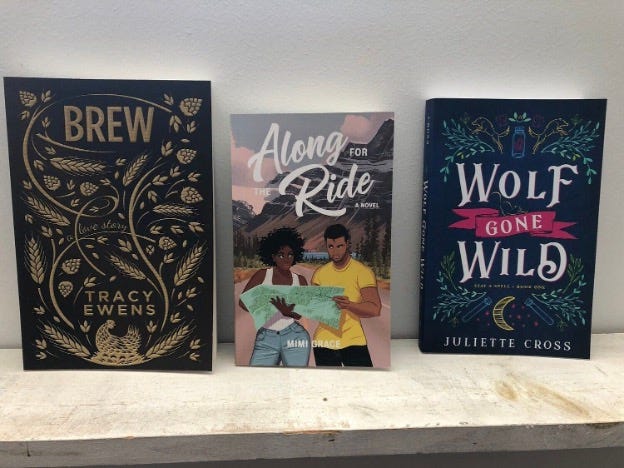
As illustrated covers return to popularity in mainstream publishing, self-publishing is getting in on the illustrated game as well. I have no problem with this! Go nuts! However, you do want to remember your target demographic. Be careful not to let your cover end up looking like a kids’ book. It still needs to be appealing to adults. Here are three very different, excellent examples of adult, self-published, illustrated romance covers:
5. Control your font game.
A reader needs to be able to READ the title of your book. I know that seems obvious, but you would be surprised. Especially in historicals, the prevalence of overly-ornate fonts leads to covers that literally cannot be read. Additionally, in romance we are fond of having the title of the book and the author’s name (of course), but many authors also include the series name/number. You can also consider including honorifics like “New York Times Bestseller,” but remember, every piece of text you add has the potential to clutter up your cover to the point that a reader can’t identify the title. (A completely personal opinion is that putting honorifics above the author name is always unnecessary and always clutters up your cover). Be careful of using a different font for every single piece of information on your cover.
6. Don’t forget the spine.
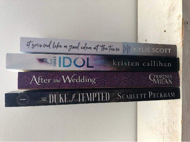
This one is big. I could write a whole article just on this. 99% of the time, no one sees the beautiful cover that you just put all that work into. They only see the spine. That’s because only a select number of books get “cover out” placement in a bookstore. Most books are shelved with the spine out. So your spine better be good. There are a lot of different options. Some people put a mini version of the cover on the spine. You can do a full wrap where the picture extends over the spine and to the back cover as well. Or a small illustration. Or keep it simple with just the title. Whatever you choose, just remember that it is the first thing people see and often the reason that someone decides to pick up your book. Here are some of the best self-published spines in our store:
7. Make it different
Scroll back up and look at Xeni and Brew. In my opinion, both those covers really stand out from the crowd in their respective markets. While part of the romance cover game is to indicate to the reader “Hey! This is a romance!” you don’t want that signaling to lead to a lack of originality. Two people holding hands in an apple orchard is not going to set you apart from the crowd.
8. You MUST order a copy of your book before it goes on sale.
I can always tell when someone has never seen the print version of their book in person. The cover text is blurry? No way would the author have sent that to print if they had seen it beforehand! I’ve seen crooked photographs, upside down spines, lots of typos… You need to hold the book in your hands before you start charging customers for it.
9. Get it right the first time (this one is personal).
The constant changing of covers is one of my biggest pet peeves as a bookseller. I know authors like it, and I don’t begrudge people who want to refresh a series after a few years to boost interest and generate income. But you have to understand that every time you change your cover, you create more work for the people whose job it is to sell your book in print. We now have to field calls and e-mails from people who want the old cover, which we can’t get once you take it out of print. If we have old editions on the shelf which no longer match the new editions, people don’t want those anymore and bookstores lose money. I’m not going to tell you never to change your cover, but consider waiting until after a series is complete. And please don’t do this every 6 months.
10. Use Leah’s patent-pending “is this cover good enough?” technique
Step 1: Take your 10 favorite books from your shelf and put them on a table. Step 2: Put your book (or a printout of your potential cover) next to them. Step 3: Ask yourself: Is there any measurable difference in quality? If the answer is yes, you need to go back to the drawing board. We, as a society, already have an understanding about what books are and what they should look like when we see them in person. If you want to reinvent what a book is, go right ahead, but it’s going to be an uphill battle. Believe me, I know it sounds obvious! But I see books that just… don’t look like books! The cover image is poor quality, or it is 5 times larger than an average book of its genre, or the word “by” appears by the author’s name (like it’s a 5th grade school report). Competing in the world of print books means you are competing with every book that a major publishing house puts out, and if you are going to go through all that effort, you might as well make sure your book looks exactly as good as theirs does.


